Components
Global
Global components appear on all pages.
Global / Navbar
Global / Footer
Global / Pop-up Sticky CTA
• Sections
Sections are used inside the Page Slot.
Section (Default)
Section / Applications


Section / Client Logos
Clients and projects using our shaped tube


Section / Contact Us
Talk to an expert today
Speak to our team to get started. Request samples, drawings, or technical datasheets.
Section / Enquiry CTA
Contact us for expert advice, quotes and free samples.
Your enquiry has been received and we will be in touch with you shortly.
Need help finding the right tube?
Talk to a specialist and find the right tube for your project.
Discover our product range
View our unique shaped metal tube profiles and joining systems.
Section / Header

Section / Hero Header
Section / Page Nav
Section / Products


Section / Sectors


•• Layouts
Layouts are used inside Sections.
Layout / 1 Column
Layout / 2 Columns
Layout / 3 Columns
Layout / 4 Columns
Layout / Blog Grid
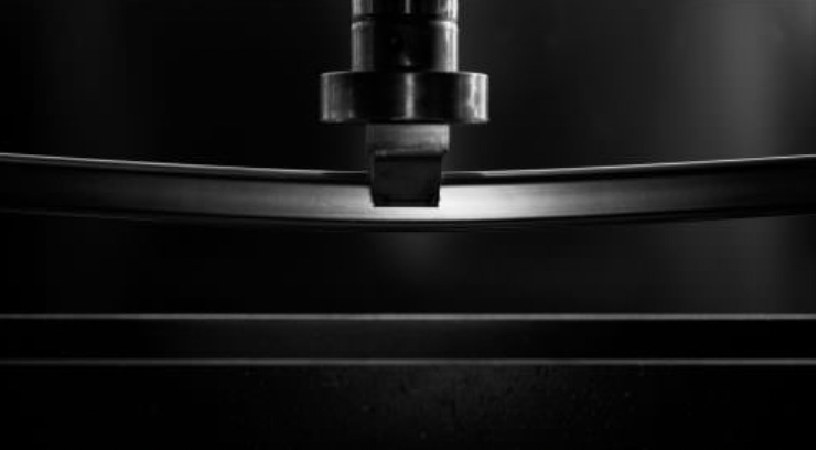
Proving the strength of formed tubes using mechanical bend tests
An exploration into two independent axial load tests on our stainless steel formed profiles, plus a brief look at how we calculate the degree of bends for formed tubes.
Exhibitors Timeless Tube engineer tube-based showcase for Southern Manufacturing and Electronics trade fair
Visitors to leading trade show for engineers and manufacturers to experience a showcase of innovative tube designs
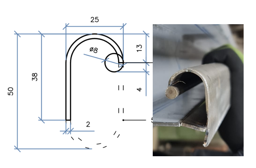
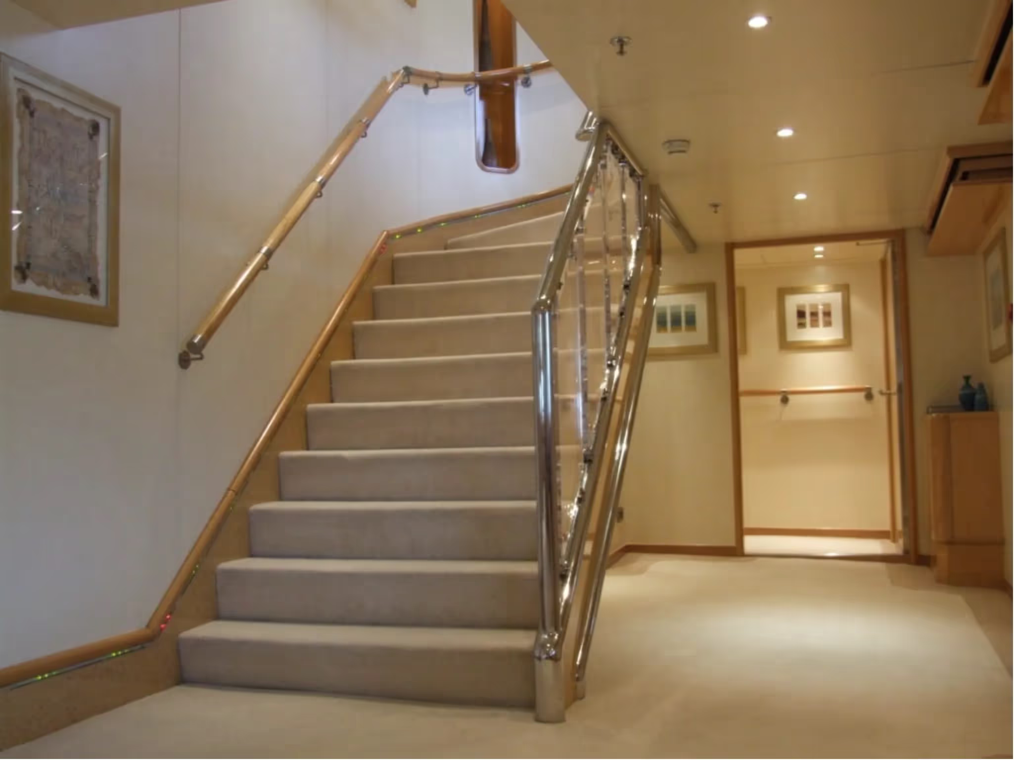
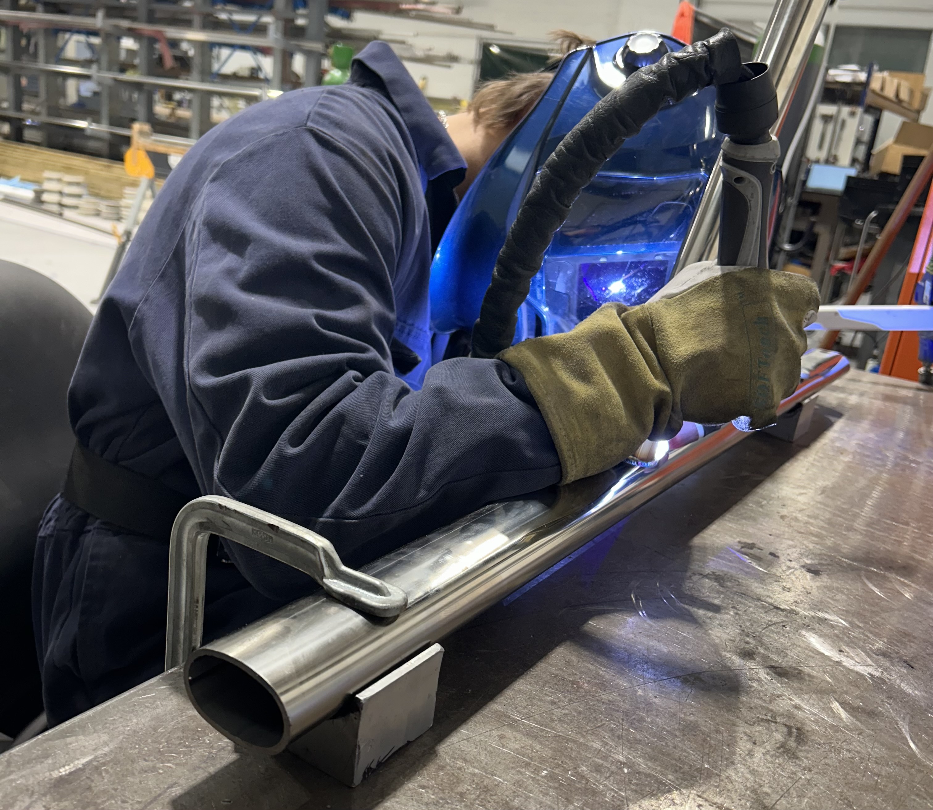
Cut Flat-sided Oval Tube Features in Stunning Recessed Handrail Project
Achieving unique designs often requires embracing trial and error. Timeless had the pleasure of working with pioneering UK-based bespoke steel fabricators Metcalfe on a one-of-a-kind recessed handrail
Layout / Button Group
Layout / Client Gallery (CMS)


••• Blocks
Blocks are a group of Elements typically used inside Layouts with a specific design or function.
Block / Accordions
Lorem ipsum dolor sit amet, consectetur adipiscing elit, sed do eiusmod tempor incididunt ut labore et dolore magna aliqua.
Block / Card
Heading 4
Lorem ipsum dolor sit amet, consectetur adipiscing elit, sed do eiusmod tempor incididunt ut labore et dolore magna aliqua.
Block / Product Link
Block / USP
Used on the Home page.
USP heading goes here...
•••• Elements
Element / Heading
Heading
Element / Rich Text
This is some paragraph text. You can highlight some to make it bold, italicised, or even add hyperlinks.
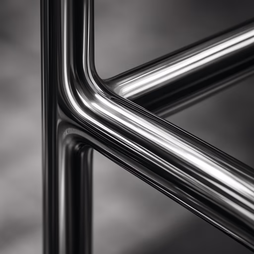
Element / Image
Element / Icon
Icon Classes can be found at https://phosphoricons.com/
Select an icon from Phosphor's library, click on "Web" to reveal its class name. Copy the class name and paste it into the icon's "Class" field in Webflow.
e.g. "ph ph-arrow-right"
Element / Eyebrow
Element / Button
Element / Page Link
Element / Breadcrumb Nav
Developers
Nested Components (ONLY for use within main parent components)
We use nested components to provide clients with multiple variant menus in a single component. Each nested component has it's Variant menu linked to up to the top level parent component.
For example:
Icon get its color variants from the nested Icon Color component and its size variants from the nested Icon Size component.
Provides size variants for the main Icon component.
Provides color variants for the main Icon component.
Provides paragraph size variants for the main Rich Text component.
H1 Heading
H2 Heading
H3 Heading
Paragraph text goes here. you can add text links or bold, italics and more.
Provides size variants for top and bottom padding in Section components.
Legacy (MAST V2.0)
Prevent Clean-up
This is where you can store elements and classes used in custom code to prevent their classes/styles from being cleaned up.
